
As published in Your Investment Property Magazine, May 2013
Written by Hotspotcentral.com.au's research analyst.
Hotspotcentral.com.au's research analyst reveals his top research tips to gauge an area’s potential for future growth, and examines the most misleading indicators to avoid.
There are some statistics that I regularly see quoted as being beneficial to predicting future capital growth but they are actually the opposite. People simply haven’t thought carefully enough about what the figures mean.
FALSE INDICATORS
1. High average annual growth
The ‘average annual growth’ or ‘long-term growth’ as it is also known, is the annualised growth over the last 10 years in percentage terms.
For example, at the time of writing the long-term growth for units in Erskine, WA, was over 30%. At the other end of the scale, houses in Crosslands, NSW, averaged growth of less than 2% per year for the last 10 years.
Which of these two markets has more potential for capital growth in the immediate future? Many novice capital growth commentators would say that Erskine units in WA have proven themselves to be good long-term performers, whereas the Crosslands housing market in NSW has proven itself to be a total dud.
Without looking at any other figures apart from the average annual growth, it is actually Crosslands houses that have the most potential out of the two markets for capital growth in the future. In order to explain why, I need to go through a hypothetical example.
Imagine 100 years ago apples were 1c each and organs were also 1c each. But let’s say organges outperformed applies in terms of growth over the next 100 year. Let’s say the average growth for oranges was 6% per annum over the 100 year and apples grew at only 4% per annum. That’s not much of a difference in rate of growth, but over 100 years the price difference is staggering. Today it would cost you $3.30 for a single orange and just $.50 for an apple.
Now imagine going shopping for fruit and you see a bag of 10 oranges for $40 or a bag of 10 apples for $5. Which would you buy? You would have to hate apples or be mad for oranges to justify buying oranges instead of apples.
Long before oranges and apples got to such a huge price difference, the demand for oranges would subdue and people would instead start buying the much cheaper apples. Buyers won’t tolerate such a massive price difference for fruit that is very similar. That change in buying habit would decrease the growth rate of oranges and cause a spike in the growth rate for apples.
Something has to happen to the nature of apples and oranges to affect their growth rates. Perhaps a new orange was introduced to the market that was sweeter or easier to peel. Or perhaps a new apple was engineered that lasted longer or had a shinier skin or was bigger. These types of changes cause spikes in the growth rates. But continual positive changes like these are needed in order to maintain a continually better growth rate. Long term, apples and oranges will grow at the same rate. A higher rate of growth can’t be maintained forever.

If you were to look at the growth charts of property markets over a single year, you would see that they all have different looking charts. But if you look at them over 10 years, you can see many similarities. Stepping back even further to look at 20 years of growth and you’ll notice a common trend emerging in their growth rates.
The further you step back to look at the bigger picture, the more property growth charts all start to look the same. They all start to match the really long-term national average. Truly long term, all property markets grow at about the same rate. If they didn’t, there would be tremendous imbalance in prices that buyers simply wouldn’t tolerate.
For every year of growth above the long-term national average, you can expect a year of growth below the long-term national average to follow.
So the more years of above average growth that has stacked up in a market’s history, the more grim its future capital growth is likely to be. Similarly, the longer the stretch of below average growth in the past, the brighter the future will be to bring the long-term growth rate back to normal.
Markets are like homeostatic organisms that are always naturally moving towards a state of balance. As investors, some of the best opportunities can come from finding markets that are massively out of balance. That’s the whole idea of the demand-to-supply ratio (DSR) BoomScore, it measures the imbalance between demand and supply. [You can check your own suburb's DSR BoomScore using our free property research app, Boomtown, at boomapp.com.au. For more on the DSR BoomScore go to dsrscore.com.au.]
Be careful looking at long-term growth in isolation. You may think 10 years is a long time. But it could easily take another five years for a depressed regional market to recover. City markets are much more uniform and will balance out in a shorter period of time. But even waiting two years is a waste of loan repayments. So make sure there is some sign of growth before jumping in.
2. New developments and estates
Many people will consider the start of a new development or the opening of a new estate as a positive for a property market. There are circumstances where this is the case. However, more often than not, these events will actually represent a stifling of capital growth.
Prices change according to changes in supply and demand. If demand exceeds supply, prices will go up. The more demand exceeds supply, the more rapidly prices will rise. So we want to know of those locations that have the highest demand and the lowest supply. We want the highest demand-to-supply ratio (DSR) BoomScore.
How does the release of a new development or estate affect supply and demand? It’s simple, the supply is increased. This is something we don’t want as property investors. Instead, we want the supply to be as low as possible. Yes, that’s right, strange as it may seem, developers are actually the enemy of investors seeking out capital growth.
The opening of new housing estates can often represent a boost to the local economy. The sale of land boosts the business of local real estate agents and solicitors. And then the ensuing building activity increases the economy even further.
This increased economic activity requires more workers and they need accommodation. Workers in turn need food, petrol, clothes, entertainment, etc. So a whole host of unrelated businesses can benefit from the opening of a new estate in the years that follow. But that initial spike in supply has to be distant history for capital growth to start up. So as a general rule you should avoid markets where there are a large number of new developments.
OVER-RATED INDICATORS
Some indicators get more attention than they deserve. Again this comes from a poor understanding of what they represent, how the figures are derived and how they influence capital growth.
1. Population growth
The most over-rated indicator of capital growth is the oft-quoted population growth figures from 2006 census data. This data is more than five years old, and it is so infrequently sampled that it’s almost useless.

People don’t move into an area and live on the streets waiting for their new dwelling to become available. Instead, they move into an already vacant dwelling. Then the population growth figures are updated and then you and I hear about it.
In other words, the data is behind the eight ball. We want to know ahead of time where people want to move to and then supply that demand. Once people have moved, the demand has already been met by supply.
Population growth data is a lag indicator. The event occurs and it’s too late to take advantage of it ... unless you can firstly establish a trend and secondly assume that trend will continue.
In order to establish a trend, you need frequent sampling rates of the data. Once every five years is way too infrequent. So census data on population growth is of little help.
The Australian Bureau of Statistics (ABS) also publishes a figure called the ERP, which stands for estimated resident population. The ERP figures are a combination of census data and local council data. The ERP is sampled quarterly, which is frequent enough to establish a trend. However, the data is inaccurate geographically.
The ERP is for a local government area (LGA). An LGA may contain numerous post codes and a post code may contain numerous suburbs. There are some post codes in Australia that contain only one suburb and others that contain more than 100.
Having the population growth figures for an LGA is simply too wide an area for an investor to know which suburb to buy in. How do you know if the growth is evenly distributed amongst all post codes and all suburbs within all post codes? What if there are a handful of suburbs in one post code where the majority of new residents are moving to?
Another problem with population growth figures is that there is no break-down of what the figures comprise. Four variables are needed:
- number of deaths
- number of births
- number of people moving out
- number of people moving in
For example, assume there was a suburb that experienced 10% growth over the last 12 months. That’s an extraordinary increase. But what if all 10% was due to births? Here’s a hot tip for novice investors: babies don’t buy properties. You’d be better off opening a store that sells prams in such a location.
Some will argue that bigger families require bigger housing. That’s true, but the new property they move into will be balanced with a vacant one they leave behind. So the extra births don’t increase the demand for additional dwellings, they just change the nature of dwellings required.
And what if the market that experienced this 10% population growth by births was 100% apartments? It’s possible the parents of those babies will make a decision to raise their child in a house rather than an apartment. Perhaps they now need four bedrooms and there are no apartments with three let alone four. Given that there is no suitable accommodation, young families may decide to move away. Suddenly there is a mass exodus, leaving many vacant properties just after the positive population growth figures were published. This highlights how important it is to know the cause of the change in population. And the population data available in this country simply isn’t that detailed.
Population growth represents only one side of the demand-supply equation – it represents the demand side. What if population in a market grew by 10% and all from people moving into the area? That sounds really promising, doesn’t it? But what if a bunch of developers just released enough dwellings to accommodate a 20% increase in population? If that were the case, supply would exceed demand and prices would actually drop. Again the population growth figure is leading investors down the garden path.
But the final nail in the coffin for population growth data is how easy it is to get much better data. Data that is sampled more frequently, that is geographically more accurate, that is a lead indicator not a lag indicator and that is gauging both sides of the demand - supply equation.
I’m talking about vacancy rates and stock on market. The number of vacant properties reflects the Demand-to-supply situation for rental accommodation. Similarly, the stock on market as a percentage of total properties reflects the demand-to-supply situation for buyers. Both are readily available and change daily.
Don’t get me wrong. I do believe that population growth is an extremely important driver of capital growth. However, the figures that are available are less useful than many investors realise.

2. Land appreciates, buildings depreciate
Many investors have heard that land appreciates while buildings depreciate. The theory is that you should buy investment properties with a high land component, namely houses. And if you’re in the hunt for a house, they say you should maximise the block size with respect to the dwelling size.
This can be misleading advice. I like to use extreme cases to prove a point, so imagine you have a block of land with no buildings on it that can depreciate. Is that a better investment than a block of land with a house on it?
Since the land doesn’t generate any income, none of the expenses related to it like loan interest, land tax or council rates are tax deductible. Similarly, there’s no depreciation that can be claimed and no rental income to help cash flow. Both houses and apartments have these advantages over vacant land.
A similar claim is that you should try to buy as many square metres for your dollar as possible. Again, taking an extreme example, you’d end up buying a big chunk of desert that wouldn’t enjoy capital growth for possibly decades.
OK, talking sense now, houses are generally better long-term investments if the full development potential on which the house sits has not been realised yet. A house on a 300m squared block may have just as much growth potential as a two-bedroom apartment next door since it’s unlikely the block of land the house is on can be developed beyond the house that is already on it. A half-acre block on the other hand has loads more potential.
A more useful figure than the number of square metres per dollar or the proportion of land to dwelling size is the land-to-asset ratio or LAR. Imagine two properties, worth $400,000 each. One of them is a one-bedroom apartment and the other is a three-bedroom house.
Assume the valuation for the house was $400,000 consisting of $200,000 replacement cost for the dwelling and therefore $200,000 land value. And imagine the replacement cost for the apartment is $100,000 and therefore has a land value of $300,000. The house has a 50% LAR while the apartment has a 75% LAR. Now assume both locations experience 10% growth in land values and 5% depreciation of building values. The new values of the two properties can be calculated as:
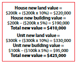
The unit is actually worth more than the house. The house investment has experienced 2.5% growth while the unit investment has had 6.25% growth. This is all due to the unit having a higher LAR.
If you’re spending the extra money to buy a house rather than an apartment, ensure that it has development potential, even if that is simply building a second storey or extending. And regardless of which dwelling type you choose, make sure it suits your specific financial circumstances and suits the demand of the local rental market.
SECRET INDICATORS
The following indicators are not readily available in the industry, but like the DSR BoomScore, provide a valuable insight into the likelihood for future capital growth. I use these at Hotspotcentral.com.au in addition to other stats to identify markets with excellent potential for capital growth.
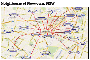
1. Neighbour Price Balance (NPB)
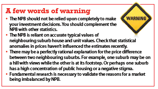
Buyers will not tolerate excessive house prices in their preferred suburb if close neighbours with similar characteristics are considerably cheaper. Instead, they’ll buy in a neighbouring suburb to save money so long as it is ‘good enough’.
If a popular suburb outperforms its neighbours for a long enough period of time, the price difference becomes more noticeable to buyers. Eventually buyers stop buying in the preferred suburb and start buying in one of the neighbours. The increased demand in the neighbouring suburb results in price growth there. The decreased demand in the previously popular suburb results in prices flattening out there. Thus the less popular suburb closes the gap between it and its popular neighbour until the market reaches balance again.
This balancing act is more likely to happen when there is a big difference between neighbouring suburbs’ typical values. It’s also more likely to happen if the neighbouring suburbs are very close – preferably right beside each other. Ideally, you want to find one cheaper suburb that is nestled very closely in amongst a bunch of more expensive suburbs.
The NPB is an algorithm I came up with to indicate the potential for a suburb to grow in order to match its closest neighbours. The NPB score for a suburb considers the price difference between the target suburb and its neighbours.
Both housing and unit markets need to be considered separately of course. And the NPB also considers the geographical distance between the suburbs so distant neighbours have less influence in the scoring than closer neighbours. This makes the NPB more accurate in gauging the potential for price balancing.
The NPB is yet another quick and easy way to perform due diligence on your target location. You can quickly and easily check the score to see if your target location has a decent NPB score or not.
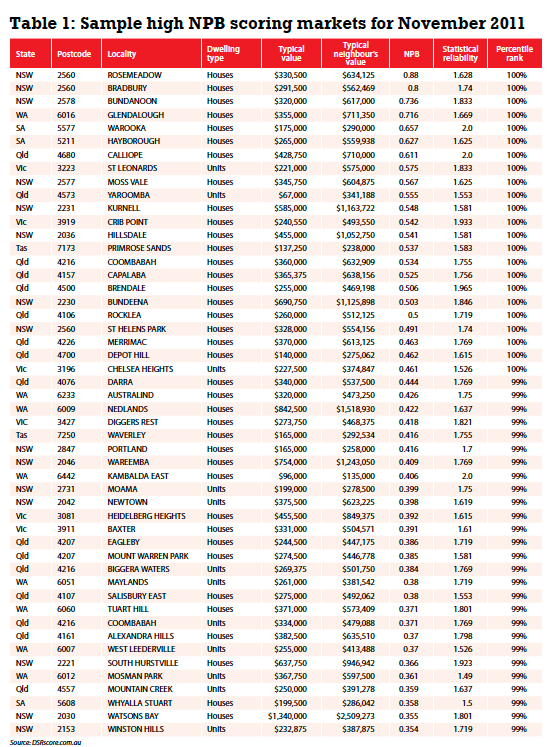
But the NPB has a higher use than that. If you have a list of all suburbs Australia-wide, the NPB can also be used to locate those suburbs with the greatest potential for this price balancing to occur. This use of the statistic can identify investment opportunities. See table 1 for a list of some of the top NPB markets in the country.
The markets listed in table 1 (below) are filtered by statistical reliability. I didn’t choose any that had an SR of less than 1.5. Note that the NPB is not a simple ratio of the target market’s typical value against the combined typical values of its neighbours. Remember that proximity plays a part.
So although some of the differences in typical values may seem large, the number of neighbours is not restricted to those that are immediately adjacent to the subject market.
2. Ripple Effect Potential (REP)
Have you ever heard about the ‘ripple effect’? It’s a phenomenon where price growth ripples from one suburb to its neighbour much like the waves on a pond. The REP is another algorithm I created. This one measures the potential for a suburb to experience price growth via the ripple effect.
The ripple effect occurs because price growth doesn’t happen evenly everywhere. That uneven growth creates imbalances. And imbalances are the investor’s opportunity.
If a suburb is nestled in amongst other suburbs which have recently grown by 20% in the last two years for example, whilst the suburb in the middle hasn’t grown at all over the same period, then there is a chance for that growth to ripple through the suburb in the middle. Of course it doesn’t have to be in the middle, it could be a ripple effect flowing out from a CBD.

The REP is similar to the NPB but instead of focusing on differences in current price, the REP focuses on differences in recent growth. The REP will identify opportunities that the NPB misses and vice versa.
Imagine, for example, a suburb on the top of a hill that has views over the suburbs that neighbour it. Because of the views, the suburb on the hill should always be more exensive than the ones at its feet.
But what if there has been a lot of recent growth among the suburbs around the hill, but not on the hill? That growth will put the neighbouring suburb prices closer to the value of dwellings on the hill. So the difference between the hill prices and the neighbour prices has been reduced by recent growth, perhaps creating an imbalance investors can capitalise on.
Perhaps the ripple started because a new bridge was built across a river or a new shopping centre opened or a train line was extended. Whatever the reason, strong growth can’t last forever. The suburb where the growth started eventually becomes too expensive and the growth ripples to its neighbours.
CONCLUDING REMARKS
Does your location of interest have any ripple effect potential? Is it about to experience some neighbour price balancing? The REP and NPB are just extra tools you can use to: identify a potential hot spot; validate a hot spot recommendation; or decide between two markets that are equal in most other aspects. Although you won’t have these figures Australia-wide, you can at least apply the ideas to markets you’re currently researching.
If consideration of just one extra statistic earns you a thousand dollars more from making a better investment decision, wouldn’t it be at least worth the trouble? Don’t let anyone suggest to you that you didn't perform enough due diligence; consider all the stats.
Your Investment Property Magazine
May 2013